Whats New in Ubuntu 13.04 ‘Raring Ringtail’?
Raring Ringtail is a short term release, which would be supported for 9 months, successor to Ubuntu 12.10 Quantam Quetzal.
Excitedly, most of the users have made the switch, almost of them expecting to see a real change in the OS. This could be partly due to the fact that they’ve got tired of using the same old interface, and can do with slight changes, and partly due to the fact that they aren’t satisfied with its performance.
The question arises, is there anything new in new-est version of the OS?
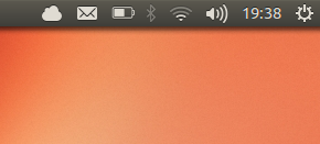
Well, there have certainly been a few slight changes, i.e. visual ones, that include an “ubuntu one” icon in the top bar, similar to that of the “CloudApp” in MacOSX. Apart from that, there is now a BT menu in the top bar, with a few essential options.
The “Dash” icon, has been changed to.. well, this:


13.04’s launcher vs 12.10s (sorry for the poor quality of the latter.)
Similarly, the “Software Center” icon has been redefined along with the “Workspaces” Icon, (which by the way are not enabled in 13.04 by default; see this post), and what used to be the “Home Folder” in the older versions, is now known as “File Manager,” (complete with a new icon.) All the icons are now slightly more pointed, means the corners are less round.
So, these were all the visual changes. Now to performance.
I’m sorry to say that it’s still the same old ubuntu, still a bit slow, even on “hi-fi” spec-ed computers. YET, i can see a reduce in the lags, e.g. it actually used to hang whenever i’d start a VM in 12.10, but in 13.04, i actually managed to run a VM alongside Chrome and the software center!