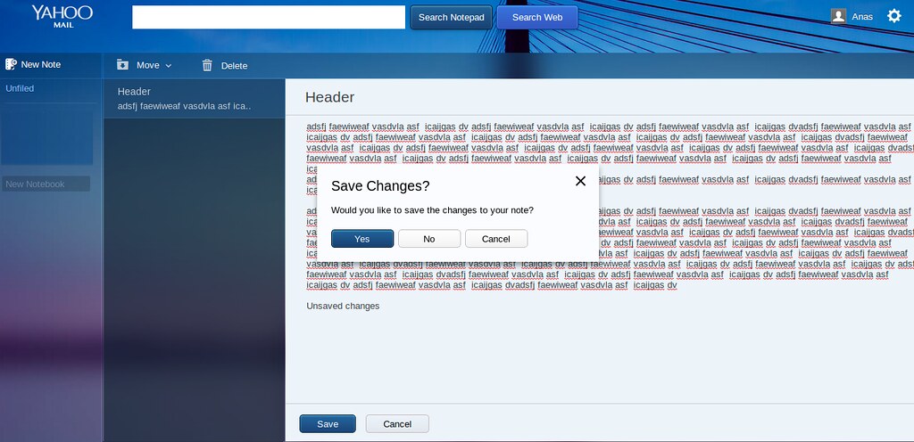
The Yahoo Notepad gets the new look
 Yahoo Notepad, one of my personal favorites of such apps on the web, has recently been altered in terms of UI, and the new look, no doubt, and improvement, at least in terms of readability, greatly resembles or happens to be identical to yMail’s new theme. Also, there’s a change in the terminology (_slight) _and perhaps a feature or two has been introduced.
What used to be folders, are now called “notebooks”, _and also, they’ve added a search bar, rather similar to the one they have on ymail. Only this one offers to actually search through all the notes. Other than that, the new UI is way more user-friendly than the older one. Creating, Modifying/saving, deleting notes and notebooks, every single one of these tasks were like slow and taxing in terms of UI back in the old interface. e.g. to rename or move or delete a folder or note you actually had to navigate to that one and then select stuff from menus e.t.c. but now, it has evolved to a slightly ‘_straight-forward’ _sort of UI, and yet _sleeker. _To create a new notebook, you simply have to type a name in the input box that says “_create new notebook” , and press enter. To rename or delete notebooks, they’ve added a right-click context menu. Just move your cursor over to the notebook and right-click.
Another minor improvement is that whenever you are switching from one note to another and have made unsaved changes, it’s gonna prompt you and ask whether or not you are willing to save your work. Good, cause in the previous one, you can keep on switching from one note to another without realizing that all his work was being lost. A warning like this would do.